 Vidova
Use an animated element
An element is a reusable graphic or animation with its own controls. It can supply a title treatment, a counter, a callout, or a more elaborate composition. In project files and some tools, elements are called components.
See finished examples on the video components page. Each preview there is a real render from Vidova.
Choose Add → Element on the timeline to browse published elements, or ask chat to find one and place it in your film. This catalog is separate from your account’s uploaded-media Library.
Find an animated counter element. Add it after the opening shot, count from 0 to 100, and hold the final number long enough to read.
Project elements appear under the Elements filter in Assets. Choose + on a card to place another clip of an element.
Browse, preview, and add an element
- Move the playhead to where the element should start.
- Choose Add at the right end of the timeline toolbar, then Element.
- Search for the subject or treatment you need. The catalog groups results into categories such as Text, Data, Shape, Overlay, Screencast, and Caption.
- Hover a card to watch its preview.
- Select the card. Vidova adds the element to the project the first time and puts a clip of it at the playhead.
The clip is selected, so its inputs open in the Inspector. Move the playhead into the clip to see the result; the first frame of an animated element can be empty.
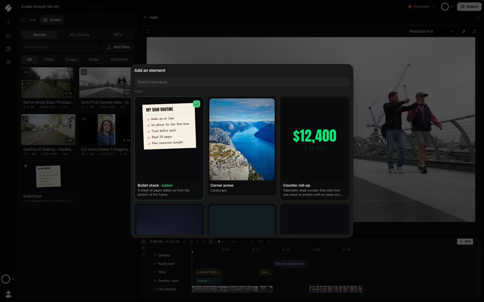
Choose Add → Element on the timeline to browse the catalog. Selecting an element puts a clip of it at the playhead.
- The checkmark and “added” label mark an element this project already has.
Select the image to open the original full view.
Customize an element
Select the element’s clip and open Inputs in the Inspector. Each element defines its own controls: these may include text, colors, numbers, fonts, or media references.
Use Timing to set when it plays and how long it lasts. Preview both the entrance and the ending after changing the duration. Some elements use the available time to fit a whole animation sequence.
Describe a custom change in chat when it goes beyond the exposed inputs. Include what should move, what should remain visible, and the exact text or media to use.
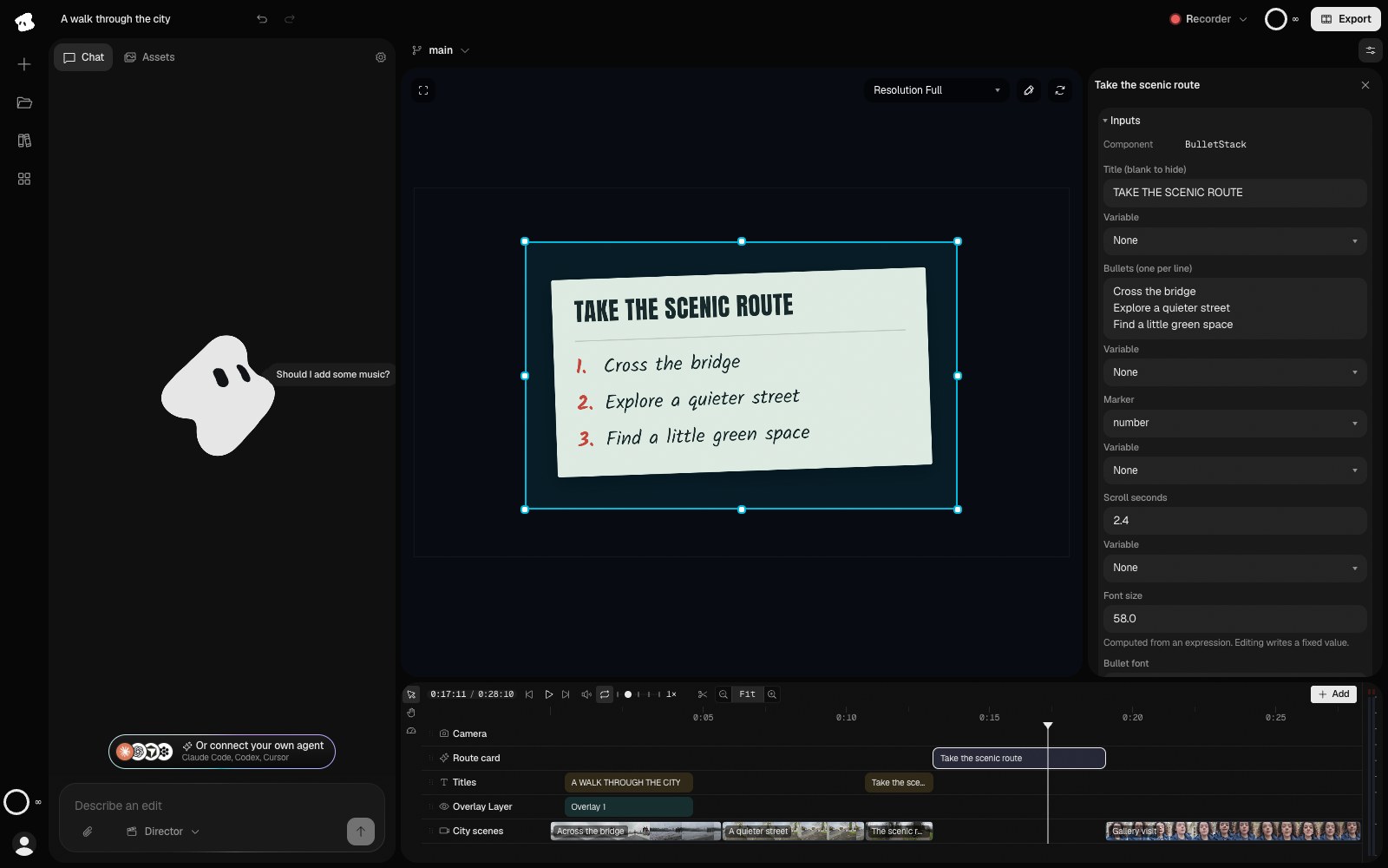
Inputs customize this instance of Bullet stack. The separate preview image below shows the finished composition with the Inspector closed.
Select the image to open the original full view.
Understand the input controls
| Input | How to use it |
|---|---|
| Text | Enter the wording. Follow the element’s label for multiline lists or structured content. |
| Number | Set a count, size, duration, or other numeric setting described by the label. |
| Color | Choose a color for the part of the design named by the control. |
| Choice or switch | Choose one of the element’s supported modes or enable an option. |
| Font | Choose the typeface when the component exposes a font control. |
| Media or analysis | Reference the appropriate project asset, transcript, beats, audio, or track. Ask chat to connect it if you are unsure which reference the element expects. |
An element exposes only the controls its author defined. The Inputs section can therefore look different for a counter, a caption treatment, and a screen callout. Changing a number in one element does not imply the same range or meaning in another.
Example: an animated list
Bullet stack presents a sheet of paper with lines that reveal as it moves into view. Its controls include a heading, one bullet per line, marker style, reveal timing, and paper and ink colors.
Add Bullet stack after the final shot. Set the title to “TAKE THE SCENIC ROUTE” and the bullets to “Cross the bridge”, “Explore a quieter street”, and “Find a little green space”. Use numbered markers and hold the completed list long enough to read.
Choose a duration that gives the reveal time to finish and leaves a readable hold. Scrub the beginning, middle, and end with the Inspector closed. See Custom components when an existing element needs a different layout or behavior.
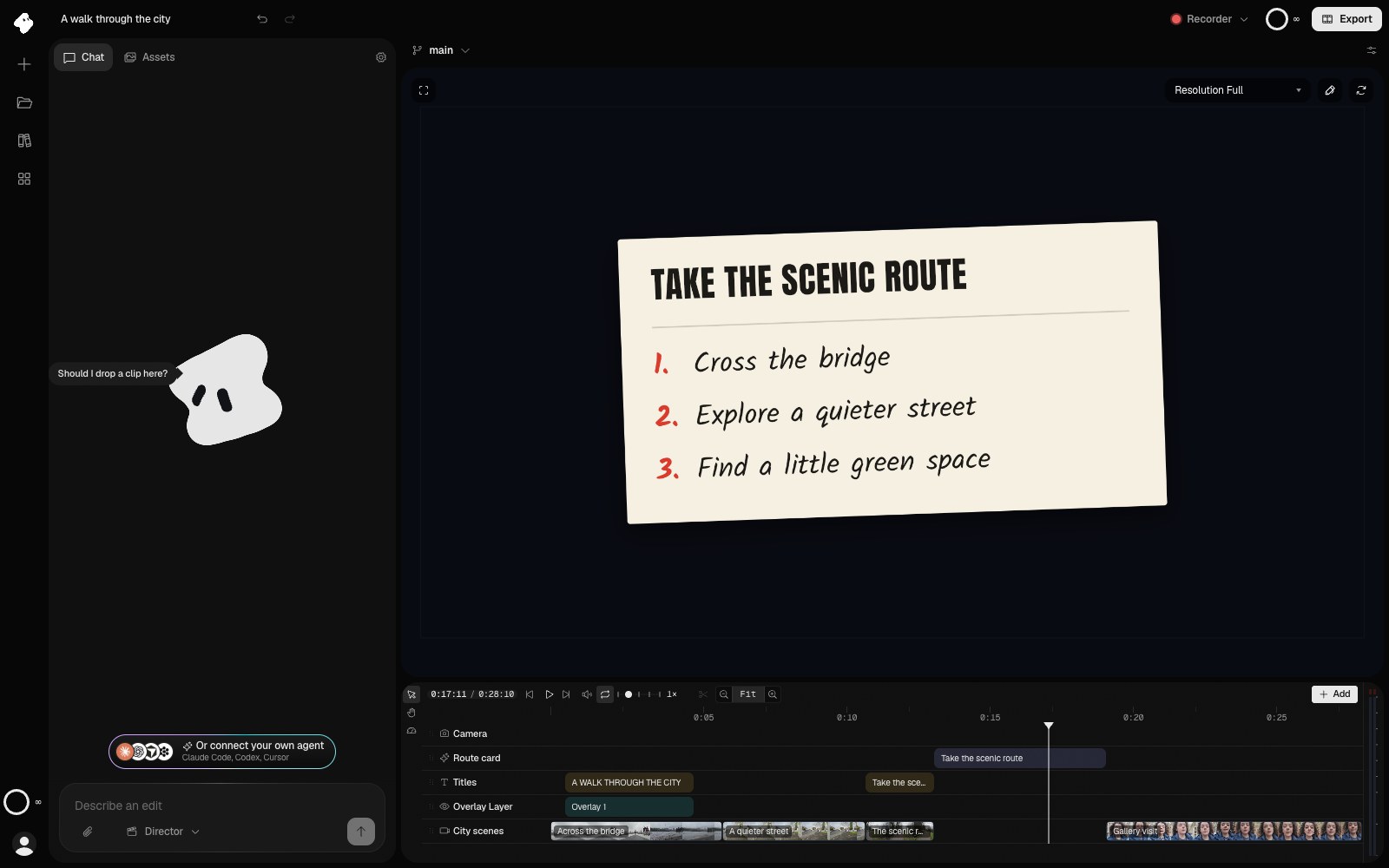
Bullet stack after its reveal: the heading, three lines, and numbered markers are set through the element’s inputs. The playhead is four seconds into the component clip.
Select the image to open the original full view.
Reuse the design without tying every clip together
Place the same project element more than once. Each clip has its own timing, placement, and input values, so one can show a different heading or count from another.
The component source is shared by those uses. Changing the underlying component can affect them all. Use per-clip inputs for individual wording and colors, and Project variables for values you deliberately want to update together.
Share a value across the project
A variable stores a value you want to reuse, such as a brand color, a product name, or a number shown in several places. Linked fields update together when that value changes.
- Ask chat to create the variable, for example “Make a color variable named brand set to #F26B1D.”
- Select a clip and find a compatible field in the Inspector.
- Choose the variable from the field’s Variable selector.
The selector appears when a matching variable exists. Use types that match the purpose of the field. The Project variables guide explains the available types, linking, and how changing a type affects its value.
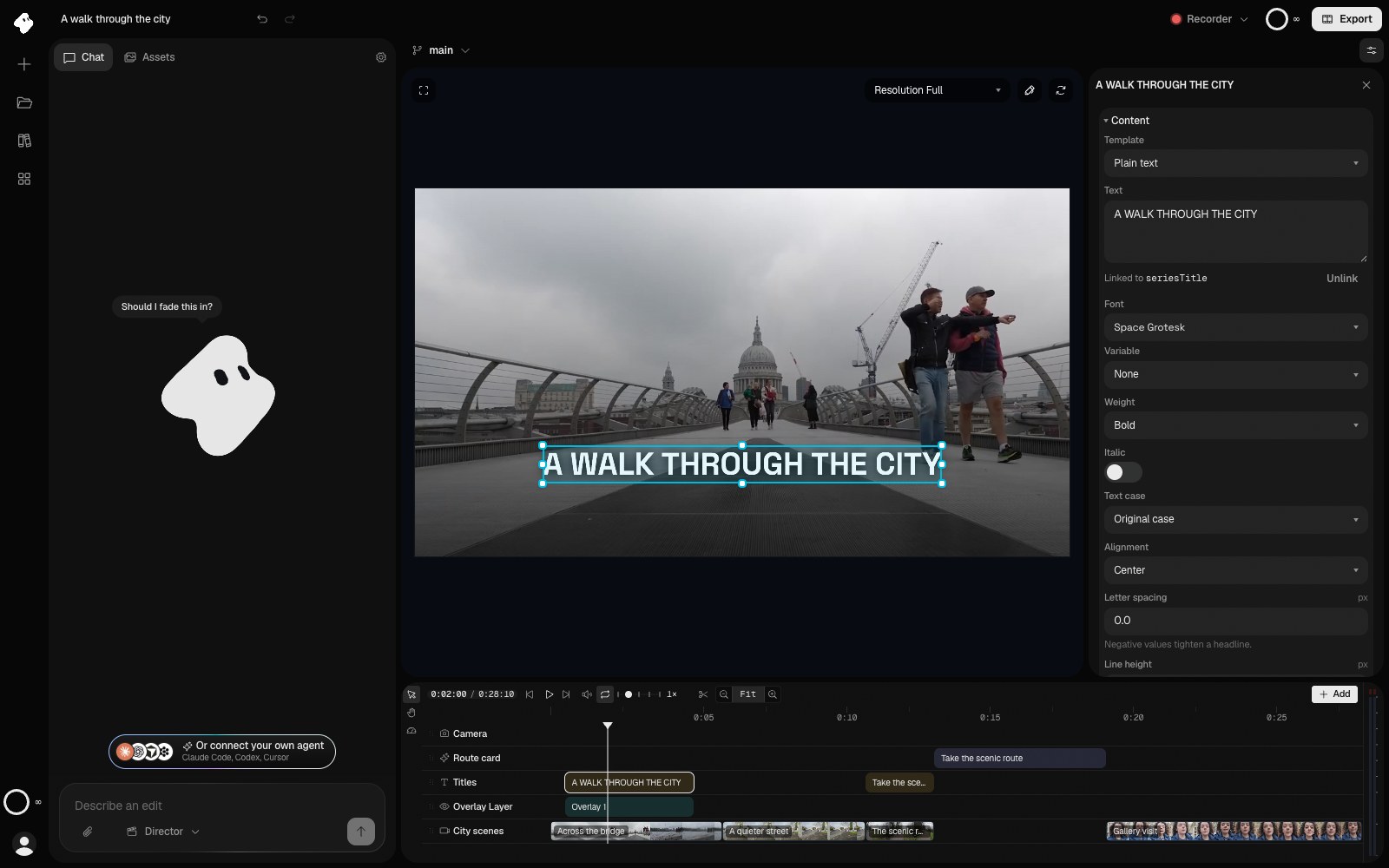
The title's text is linked to seriesTitle, which holds the same words. Change the variable to update every linked field; Unlink makes this field independent again.
- The text is linked to the seriesTitle variable. Unlink makes it independent again.
Select the image to open the original full view.
Change one clip independently
A linked field shows Linked to followed by the variable’s name. Choose Unlink to keep its current value and edit that field independently.
For example, link several backgrounds to a color variable named brand. Change brand once to update them together, then unlink a single background if the closing card needs a different color.
Use Versions and undo before exploring a substantially different design.
When an element does not look right
- Nothing is visible: confirm there is a timeline clip, place the playhead inside it, and check layer visibility and opacity.
- The opening frame is empty: scrub into the entrance animation before deciding the element is missing.
- The animation ends too soon: compare the clip duration with its reveal or timing inputs, and leave time to read the result.
- Text spills out: shorten it, adjust the element’s size controls, or ask chat to adapt the layout to the canvas.
- A media-driven graphic is incomplete: check that its referenced asset or analysis result exists and is ready.
After a fix, close the Inspector and review the whole frame. Check a small preview as well as a large one, especially for graphics intended for a phone screen.